E-commerce
Designing a clean and intentional candle brand
COMPANY
KOZE COLLECTION
ROLE
Branding, UX/UI, Product, E-commerce
The candle market is highly saturated, often divided between mass-produced products with questionable compositions and high-end brands disconnected from everyday use.
With Koze, I wanted to create a clean, thoughtfully designed candle brand that is both aesthetically minimal and mindful of health.
Each decision, from wax selection to fragrance composition, was guided by simplicity, transparency and the desire to create products that feel good to use, not just good to look at.
Koze is a personal end-to-end project that I built from scratch, covering brand strategy, product design, UX/UI and e-commerce, while navigating real-world production and business constraints.
Brand strategy & positioning
Defined the brand positioning and value proposition in an oversaturated candle market, with a strong focus on clean composition, simplicity and well-being.
Clarified the target audience, brand pillars and differentiation strategy to ensure consistency across product, visual identity and messaging.
Brand identity, guidelines
Designed the visual identity of Koze, including logo, color palette, typography and overall art direction.
Established simple brand guidelines to ensure visual consistency across products, packaging and digital touchpoints.
Product design
Designed the candle products themselves, including shapes, materials and finishes, while balancing aesthetics, usability and production feasibility.
Made conscious choices around wax, wicks and fragrances to align with the brand’s clean and health-conscious positioning.
UX/UI & Shopify
Designed and built the e-commerce experience on Shopify, focusing on clarity, reassurance and storytelling.
Structured the information architecture, product page and content to support decision-making and create a calm, intuitive purchasing journey.
Production constraints & sourcing
Managed real-world constraints such as small-scale production, sourcing of materials and regulatory requirements.
Adapted design and product decisions to align with production timelines, budget limitations and compliance standards.
The main challenge was to create a differentiated candle brand that balances three often conflicting aspects:
• A clean and health-conscious composition
• A strong yet minimal brand identity
• A smooth and reassuring online purchasing experience
All while managing limited resources, small-scale production and regulatory constraints.


Material and composition choices were guided by durability, clean use and sensory experience, resulting in the use of Jesmonite containers, wooden wicks, natural soy wax and carefully selected fragrances.
Jesmonite containers
Jesmonite was chosen for its mineral feel, durability and versatility, allowing handcrafted production while maintaining consistent shapes and finishes.
Wooden wick
The wooden wick was selected to create a soft crackling sound, reinforcing the idea of ritual and warmth, while also ensuring a clean and stable burn.
Natural soy wax
Natural soy wax was used for its clean-burning properties and lower emission of harmful substances compared to traditional paraffin wax.
Carefully selected fragrances
Fragrances were chosen without unnecessary additives, focusing on compositions free from CMR substances and phthalates to align with the brand’s health-conscious positioning.
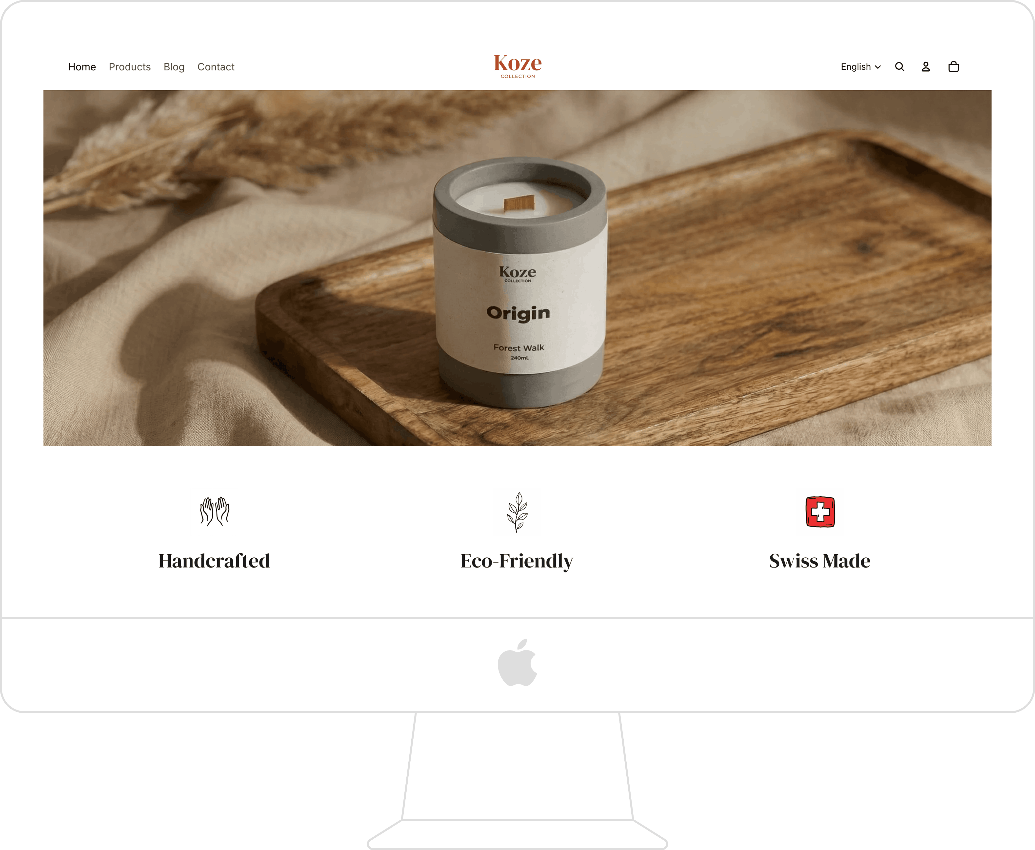
The e-commerce experience was intentionally designed to remain simple and focused at launch.
Shopify was chosen as the platform to ensure a reliable, scalable and user-friendly foundation, allowing quick iteration without compromising on usability.
As the brand launched with a single product, the website structure was deliberately reduced, concentrating the storytelling, product information and value proposition on the homepage, while still providing a dedicated product page for users seeking detailed information.
Particular attention was given to brand values, transparency and reassurance, ensuring that users clearly understand the philosophy and intentions behind Koze.
To support credibility in a Swiss context, the website is available in German, French and English.
A blog section was also introduced to support long-term SEO, with the objective of publishing one article per month to progressively build organic visibility.

While Koze is still at an early stage, the launch confirmed the viability of the concept and provided valuable insights to guide future iterations.